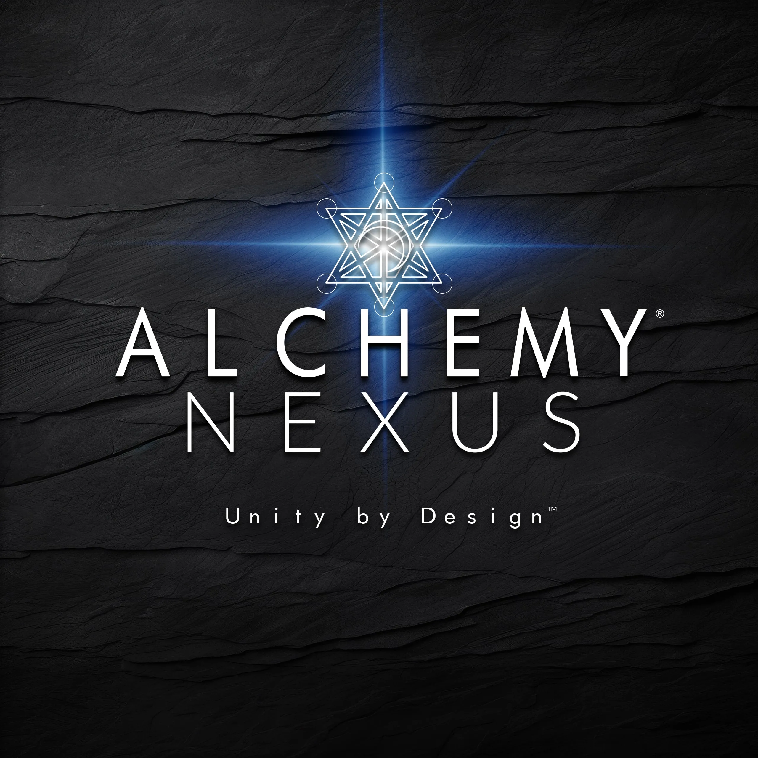
Our Brand

Our brand is more than a logo — it’s a map of our philosophy, our values, and our vision. Every line, circle, and curve in our mark tells a story about connection, transformation, and the pursuit of excellence.
Metatron’s Cube:
The Blueprint of Creation
At the heart of our identity lies Metatron’s Cube, a sacred geometry symbol representing the interconnectedness of all things and the fundamental blueprint of creation.
Formed by 13 perfectly placed circles connected by straight lines, this geometry contains all five Platonic solids—the foundational shapes of all physical matter.
For us, Metatron’s Cube embodies:
-
Interconnectedness – Every idea, project, and person is linked within a greater whole.
-
Balance & Harmony – The interplay of circles (feminine energy) and lines (masculine energy) reflects our approach to combining creativity and structure.
-
Infinite Potential – As the “Fruit of Life” in geometric form, it symbolizes that from a single point, endless possibilities emerge.
It’s also a nod to Archangel Metatron, the divine scribe and mediator, mirroring our role in translating vision into tangible, functional design.

The Alchemy Crescent:
Where Inspiration Aligns
Embedded at the heart of Metatron’s Cube in our logo is the Alchemy crescent—a symbol that appears across our daughter brands.
The crescent shape embraces three circles of varying sizes, representing the Moon, Earth, and Sun, as well as the supermassive singularity at the center of our galaxy.
This celestial motif reminds us that innovation is a cosmic process—born from cycles, influenced by forces far greater than ourselves, and always moving forward.
